
Global Power Metrics: 120 Years of Rise and Decline, Scored
I have been building a markets analytics tool for a while now, and one of the things it does is empire cycle analysis. Rather than reading yet another opinion piece about whether America is finished, I wanted to sit down and actually score the thing, decade by decade, and see what the numbers said.
So this week I ran the full historical pass and generated a report out of it. Nine determinants of national power, eight global powers, thirteen decades from 1900 to 2020. That is 810 data points, and the results are more interesting than I expected.
The framework
The scoring follows Ray Dalio’s Big Cycle work, which argues that empires rise and fall through a fairly consistent set of measurable determinants. Each power gets a score from 1 to 10 on each of the following, for each decade:
- Economic Output - share and absolute level of global GDP, nominal and PPP adjusted
- Trade - share of global trade, surplus and deficit dynamics, supply chain integration
- Competitiveness - cost, productivity, infrastructure quality, competitive rankings
- Innovation - R&D as a share of GDP, patent output, frontier technology, commercialisation
- Military - defence spending, force projection, nuclear status, combat effectiveness
- Financial - depth of capital markets, global financial centre status, banking strength
- Reserve Currency - share of global FX reserves held in that currency
- Education - literacy, PISA and TIMSS scores, university quality, the STEM pipeline
- Governance - institutional quality, rule of law, political stability, capacity for reform
A 1 or 2 means near collapse or irrelevance. A 5 or 6 means middling. A 9 or 10 means globally dominant and at or near your own historical peak. Scores come off IMF, World Bank, WTO, SIPRI, WIPO and OECD PISA data plus the academic literature, and every one of them is sourced in the underlying database.
Not every power has data for every decade. The EU is tracked from 1950 when the ECSC was founded, India from 1950 and Saudi Arabia from 1940, which is when their modern states begin. The US, UK, China, Japan and Russia are tracked across all thirteen.
The composite index
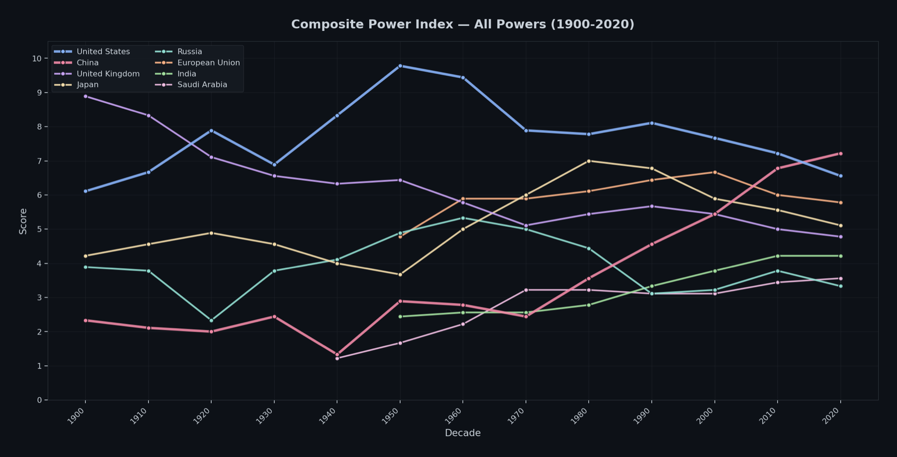
Averaging all nine determinants gives you a single number per power per decade. Here is the whole dataset in one chart:
And the same thing as a table, at the key decades:
| Power | 1900 | 1920 | 1940 | 1960 | 1980 | 2000 | 2020 |
|---|---|---|---|---|---|---|---|
| United States | 6.1 | 7.9 | 8.3 | 9.4 | 7.8 | 7.7 | 6.6 |
| China | 2.3 | 2.0 | 1.3 | 2.8 | 3.6 | 5.4 | 7.2 |
| United Kingdom | 8.9 | 7.1 | 6.3 | 5.8 | 5.4 | 5.4 | 4.8 |
| Japan | 4.2 | 4.9 | 4.0 | 5.0 | 7.0 | 5.9 | 5.1 |
| Russia | 3.9 | 2.3 | 4.1 | 5.3 | 4.4 | 3.2 | 3.3 |
| EU | — | — | — | 5.9 | 6.1 | 6.7 | 5.8 |
| India | — | — | — | 2.6 | 2.8 | 3.8 | 4.2 |
| Saudi Arabia | — | — | 1.2 | 2.2 | 3.2 | 3.1 | 3.6 |
There is the headline, and it is a big one. China’s composite is now 7.2 and the US is 6.6. The crossover has already happened, somewhere around 2015 on this data.
Now before anyone gets carried away, that topline is misleading and the report says so directly. Break the composite back apart and the US still holds decisive leads where it matters most for the current order: military 9 to 8, financial 8 to 7, and reserve currency 8 to 3. Innovation is a tie at 8. China leads on trade 9 to 5, competitiveness 8 to 5, and education 8 to 5. So one of them owns the plumbing of the existing system and the other owns the factories and the classrooms. Those are very different kinds of power and averaging them into one number hides the whole argument.
The United States
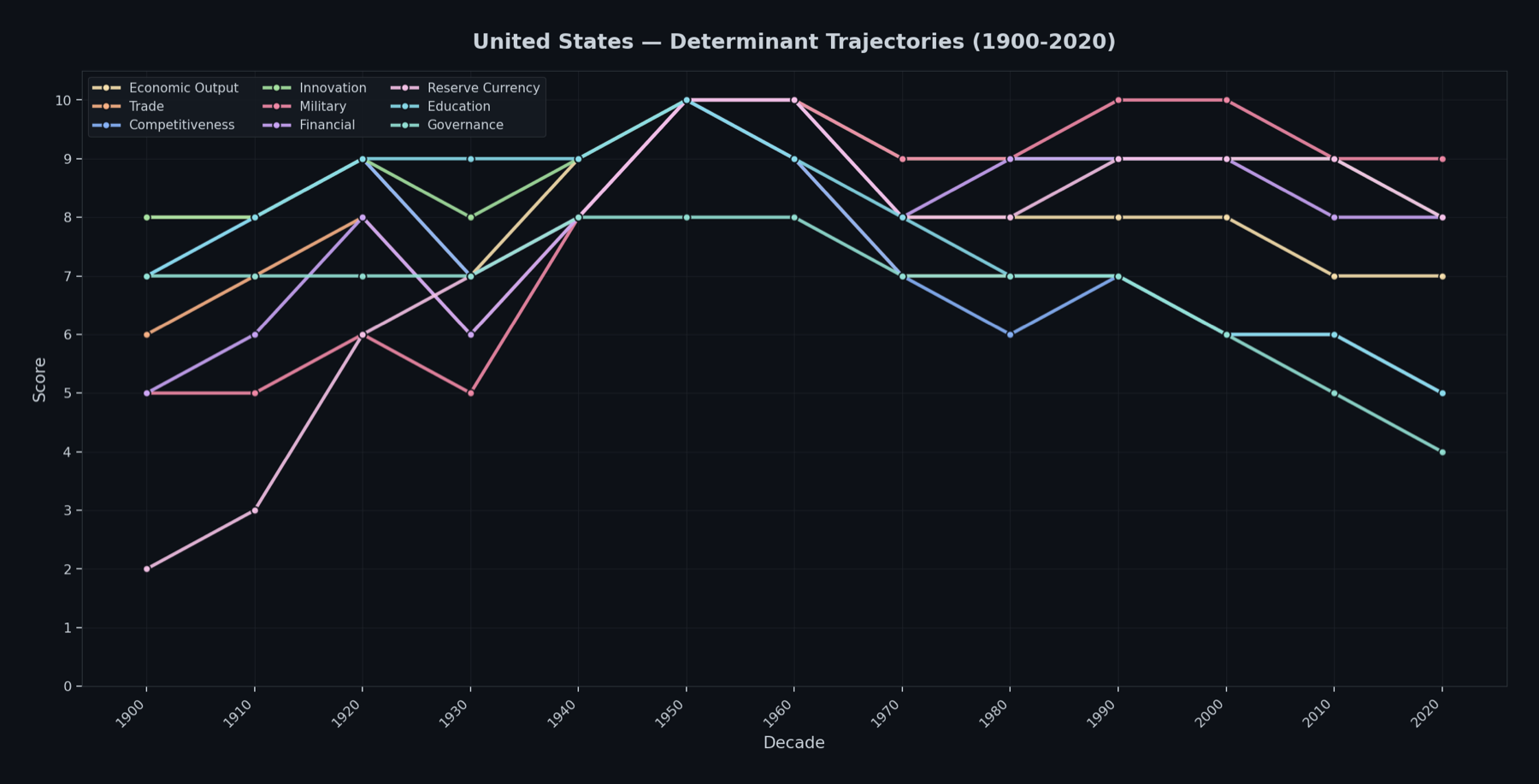
The US peaked at a composite of 9.4 in 1960, which is the highest score any power reaches anywhere in this dataset. It is worth being honest about why. That peak was an artefact of having been the only major industrial power whose homeland came through the Second World War unscathed. Everyone else was rubble. Some reversion was always coming as Europe and Japan rebuilt.
What is not an artefact is the shape of the decline since. Education has gone from 10 to 5. Trade from 10 to 5. Competitiveness from 10 to 5. Governance from 8 to 4, and that last one reflects the deepest domestic political polarisation since the Civil War.
The inflection points are worth listing out because they are all recognisable:
- 1950-1960 - absolute peak across nearly every determinant
- 1971 - Nixon closes the gold window, and the first trade deficit signals the end of unmatched economic dominance
- 2000-2001 - China joins the WTO, the dot-com bust lands, and trade and competitiveness begin eroding
- 2008 - the GFC damages financial credibility and accelerates the loss of institutional trust
- 2020 - COVID governance failures, the worst polarisation metrics in the series, and the Capitol riot
The dollar’s share of global reserves has gone from 72% in 2001 to somewhere around 54 to 58% now. Federal debt is at 100% of GDP and the CBO baseline has it at 120% by 2035, at which point interest payments become the fastest growing line in the budget and crowd out exactly the investment in education, infrastructure and competitiveness that would be needed to arrest any of this.
The one strong card is AI. US leading-edge chip production dwarfs China’s, and the innovation and financial scores are still at or near the top. Whether that is a moat or just a lead is the entire question.
China
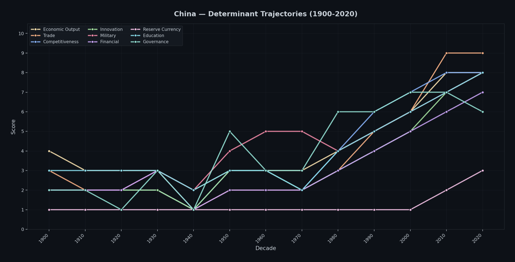
China’s trajectory splits cleanly in half, and the first half is grim. From the Qing collapse through warlordism, Japanese invasion and civil war, China bottoms out at a composite of 1.3 in the 1940s, which is the lowest score in the entire dataset. Then Deng’s reforms in 1978, WTO entry in 2001, and a climb to 7.2. That is the steepest positive trajectory anywhere in the series and it is not close.
The plateau signals are showing up though. The fertility rate is around 1.0 and the population is falling. There is a property sector crisis and youth unemployment. And there is a structural contradiction at the heart of it that I think is underrated: China cannot get full great power status without the RMB becoming a real reserve currency, and that requires opening the capital account, which means giving up control over capital flows. Reserve currency sits at 3 and the RMB is 2.3% of global reserves. That is the ceiling, and it is a self-imposed one.
The UK, which is the cautionary tale
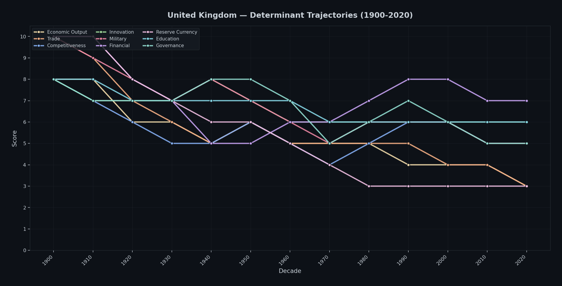
As a Brit this one is a bit bleak to look at. The UK goes from 8.9 in 1900, top of the world in trade, finance, military and reserve currency, to 4.8 in 2020. Steepest negative trajectory in the dataset.
What I find useful here is that the decline was not a single event. It happened in stages that were each survivable and collectively terminal. WWI bankrupted the empire, WWII finished the job, Suez in 1956 exposed the reality to everyone including us, and the sterling crises of the 60s and 70s ended any pretence of financial primacy. Sterling now holds 4.7% of global reserves, down from being the reserve currency.
The partial arrest is interesting too. The Eurodollar market in 1958, Big Bang in 1986, and London reinventing itself as a financial and professional services centre is a real achievement, and financial services is still a 7 while economic output has fallen to 3. Brexit has put that model under stress, with trade dropping to its lowest score since just after WWII.
The report’s line on this is that the honest parallel is the Netherlands after its Golden Age. A prosperous, well governed, smaller power that keeps some genuine niche strengths but no longer shapes the global order. Which, fine, could be worse.
Everyone else, briefly
Japan is the Big Cycle cautionary tale in the other direction. Up from 4.0 in 1940 to a peak of 7.0 in 1980, “Japan as Number One”, the Nikkei at 38,957 in 1989 and Tokyo real estate valued above all US real estate combined. Then 1989-1990 produces the sharpest single-decade decline in the whole dataset. Economic output 9 to 5, competitiveness 9 to 5, trade 8 to 4. It has stabilised at 5.1 and will stay wealthy and well run, but its days as a top three power are done.
Russia has two arcs. Revolutionary chaos at 2.3 in 1920 up to superpower status at 5.3 by 1960, with military peaking at 9. Then collapse, from 4.4 in 1980 to 3.2 in 2000. Military is the only determinant where it still has genuine global weight, and even that has been degraded by Ukraine. The economy is a war economy producing output that does not translate into civilian productive capacity. The description in the report is that Russia is transitioning from a fading great power to a regional power with nuclear weapons, which sounds about right.
India is the one to watch. Fastest riser in the dataset, every determinant except governance and reserve currency trending up, and a demographic window running to the mid-2040s that no other major power has. Median age 28, against 38 for China and 49 for Japan. India’s composite today (4.2) is roughly where China was in the early 1990s. If it sustains, it hits China’s 2010 level somewhere around 2040 to 2045.
Saudi Arabia is the odd one out, the only power whose entire rise is attributable to a single commodity. Competitiveness, innovation and education all plateaued at 3 to 4 for decades, textbook resource curse. Vision 2030 is the most serious attempt any petrostate has made to escape that trap, and with extraction costs at $5 to $10 a barrel they will be the last producer standing regardless.
What converges, and what doesn’t
This is the part I had not thought about before and it is probably the most useful takeaway.
Education is converging fast. In 1950 the spread between top and bottom was 9 points. By 2020 it is 4, and the top spot is now shared between China and the EU rather than held by the US. Mass literacy is basically universal and PISA performance is bunching up across the developed world.
Innovation is converging at the top. The US had a monopoly on frontier innovation in the 1950s and 60s, scoring a straight 10. That is now an 8, matched by China, with the EU steady at 6. The AI race is a two player game and everyone else is watching.
Reserve currency is not converging at all. The dollar sits at 8 and faces no credible single challenger. The euro is a distant 6 and the RMB is a 3 held back by capital controls. What is happening is slow fragmentation rather than replacement. The dollar’s share falls roughly 0.75 percentage points a year, which still leaves it above 40% in 2040.
That last one matters more than the other two, because it is the difference between a disorderly collapse and a long managed erosion, and almost everything you read online assumes the former.
So what does the model forecast?
The structural outcomes come out as follows:
| Scenario | Probability |
|---|---|
| Gradual US decline | 45% |
| AI extends US hegemony | 25% |
| Crisis-accelerated decline | 15% |
| Chinese stagnation | 10% |
| Multipolar stability | 5% |
The closest historical parallel scores at 7 out of 10 to the 1930-1945 British Empire decline, where the incumbent’s reserve currency lost status gradually over thirty years rather than overnight, and gold was revalued as the transition played out. There is also an 8 out of 10 similarity to the 1970-1974 Yom Kippur War and oil embargo period, which produced gold up 400%, equities down 50%, and four years of stagflation.
I would not treat those probabilities as precise. They are the output of a framework applied with a lot of subjective judgement to a small number of historical analogues, which is a polite way of saying the error bars are enormous. What they are useful for is ordering. Gradual is roughly three times more likely than crisis, and crisis is not negligible.
What I take from it for positioning
Gold comes out best supported by this analysis. It is the primary beneficiary of hegemonic transitions in every comparable period in the database, central bank buying has accelerated, and in the 45% base case it structurally appreciates as the monetary anchor of a multipolar world. That is not a trade, it is a decade.
The dollar weakens structurally but not acutely. Anyone positioning for an imminent collapse is fighting a trend that moves at 0.75 points a year.
Equities are where the power metrics get uncomfortable. US innovation at 8 or 9 supports the AI and tech valuations, but competitiveness at 5, governance at 4 and the fiscal picture are real headwinds for the broad index. The 2001-2003 parallel suggests years of sideways during hegemonic stress. The answer is selectivity by geography and sector, with a bias toward nations on rising trajectories, which mostly means India.
Commodities align with a multipolar world where industrial powers compete for resources. Uranium is supported by the AI power demand thesis, since every one of those rising innovation scores needs enormous energy infrastructure behind it. Copper benefits from Chinese and Indian electrification.
Bitcoin is the interesting one, and the honest answer is that it is scenario dependent. It sits at the intersection of de-dollarisation and collapsing institutional trust, which is exactly the thesis. But its structural case is strongest in the 15% crisis-accelerated scenario and weakest in the 25% AI hegemony scenario where dollar dominance simply persists. Meanwhile every major power is building a CBDC. I hold it, but I hold it knowing it is a bet on the tail rather than the base case.
None of this tells you what happens next year, and it is not supposed to. The whole point of scoring the determinants by decade is to get the slow variables into view, because they are the ones that decide the outcome while everyone argues about the fast ones.
The bit that stuck with me is the UK chart. Not one catastrophe, just four survivable decades in a row.
Thanks for reading!
Skylar
DISCLAIMER: This is not investment advice. It is a write-up of a research exercise using historical data, public sources and an analytical framework that involves a lot of subjective judgement. Scores reflect the framework applied and are not precise measurements. Past power trajectories do not guarantee future outcomes. Do your own research and make your own decisions.